Friday 3 December 2010

Annie Wu


Born in 1988. Escaped the sunny clutches of central Florida to roam the slightly more grey city of Baltimore. Graduated magna cum laude from the Maryland Institute College of Art with a BFA in Illustration (2010).

Spends days drawing, writing, or agonizing over past awkward social interactions that no one else remembers. Needs to find a less time-consuming way to render hair (but at least it looks nice). Would like to make things for your eyeballs.

If there is a designer and illustrator out there whose Design Practice I would like to emulate it's Annie Wu.


Work has been recognized by Spectrum 17, the Society of Illustrators 2009 Student Competition, American Illustration TRIBUTE, and Adult Swim for a few weird seconds. Clients include DC Comics, ELLE Magazine, Lacrosse Magazine, Coca-Cola Brazil and others.

Annie Wu!

JLA


Annie Wu redesigned the Justice League for Warren Ellis’ No Future Remake/Remodel: Malcolm McLaren’s JUSTICE LEAGUE challenge, whereas the prompt is to simply re-envision the Justice League as the cast of a film by Malcolm McLaren (circa 1977).

“There are a few bits I especially enjoy, like Wonder Woman’s stockings and Batman’s t-shirt.” - Annie Wu

The Flash (the drummer) - I really love the lightning bolt on the lapel of his long red trenchcoat… I really want to print a lightning bolt on a red blazer now.

Superman (the guitarist) - I actually like how simplistic this is - the hints of red in his outfit are enough to get the point across, plus you can see the subtle “S” scar across his chest.

Wonder Woman (the lead singer) - Words cannot express how awesome she looks. Those stockings, that dress, the golden lasso/microphone - Gaga approves.

Batman (the bassist) - On a side note, I hope he plays the bass with tiny Batarang-shaped picks.

Aquaman (Groupie?) - I love his glovelets. Except when he’s getting puke all over them.

Needless to say, I would totally see this film.

Saturday 27 November 2010

Thank Goodness for Herald Owlett


I met Nikki Stu at Thought Bubble comic con this November just gone. I was on a break before I had to go and shoo the cosplayers out of the royal armories and was wandering past her little store when these caught my eyes:


They're insane and quirky, just what I like in my small press comics and Nikki herself was kind enough to just talk with me. She does this in her spare time while working full time to pay those pesky bills. Through going to conventions she's met some other fabulous artists and comic creators which has allowed her network (and on a bonus, get to those cons cheaper)

I also personally want to say a big thank you too her (which I've already done, but it's nice to re-enforce it) because if it wasn't for Nikki, then Hand Drawn Awesome may have never spotted me. We're both now featured on the website and consider it a bit of a privilege to be with her on that front.

Monday 15 November 2010

The Great Perhaps

The Great Perhaps, design by Jamie Keenan:


I've seen this floating around for the past year and it is a design that's been stuck in my head for a while. I like the overlapping features and this is a design I want to carry through into my comic novel covers. Especially the fantastic four cover as the characters powers deeper. Being a comic reader, I know more about their powers and how they came across them but this isn't put across in the movie. hopefully I'll be able to explore that through a similar design.

Saturday 13 November 2010

Differnt Cover, Same Book

One of my favourite books is Let the Right One In by John Ajvide Lindqvist, which has been recently adapted for English speaking audiences in the form of Let Me In. I wanted to show the different book designs that have come about for this novel and how the film industry affects their design.

First book design as well as the original Swedish cover. It gives this eerie feeling of what the book is about as well as loosely illustrating one of the most prominent scenes in the book.

I belive this one is the original English translation cover and the girl on the front doesn't really convey the main vampire character. If you know the story, then you know why putting a girl with creepy eyes on the front doesn't really work.

Another English cover which I have yet to see on the shelves. This one give a better feeling for the book.
The version I have...and I really don't like it. This one was released just after the sweedish version of the film came out:

I think it's the shadow of Eli in the doorway that looks slightly awkward. I know they were trying to convey a weak looking image of Eli and then the shadow show's what it truly is.

Now this, I love! I'm probably biased because it's illustrated but this one would grab my attention more than the other covers. Unfortunately, I don't think its actually a book cover. Which is a shame.


And the latest one based on Let Me In. I actually prefer the version I have over this one because when I read a book, I like to imagine the characters myself. I don't want to be influenced by the characters portraying them. However, I'm under the assumption this cover relates to one of my previous posts using still's and movie posters on book designs. They're designed for the niche market who buys the book after seeing the film.

Friday 12 November 2010

Donnie Darko

Powl Goudsmit is a graphic designer from Germany and I found this while browsing through Behance. Even though it is a DVD design, it still has that feel of a book cover and even goes as far as shining a different light onto Donnie Darko. (A film which is usually seen as...dark)


Folio Society

My "outsider" brief is a competition brief set up by the House of Illustration and the Folio society. The Folio Society itself are about creating editions of some of the most beloved books in literature. However, I'm also looking into book design for my Contemporary "comic" books brief.


This is my favourite Folio Society books. The colours represent the feel of the story as a whole and the illustrations are fun to look at.


What I admire about the Folio Society is that their books do not all look the same or follow a uniformed design. However, there is a great sense that the books have all come from the same place and that quality is a major factor in their designs.

Movie Novelization

A novelization is a novel that is written based on some other media story form rather than as an original work.

Novelizations of films usually add background material not found in the original work to flesh out the story, because novels are generally longer than screenplays. Similarly, material from the screenplay or filmed scenes that are cut from the final production may still be present in a novelization, often because the novel is completed for publication while the film is still being edited for release.

The novelization designs are more often than not that of the film posters.


These covers are not appealing to me or most movie goers. They tend to cater towards those who are passionate about the film itself. There is no reason these designs could not be better and that the novels could not outshine the movies themselves.

Tuesday 2 November 2010

Chris Sanders


I've forgotten to talk about Chris Sanders and how much I like Lilo and Stitch. I am, after all, a massive child.

Chris joined Walt Disney Feature Animation in 1987 as the first person hired into Feature Animation’s newly formed visual development department. His first project at Disney was The Rescuers Down Under, where he started as part of the visual development team before making the transition to the story department. He repeated that pattern on Beauty and the Beast, for which he storyboarded several sequences, including the Beast’s death and resurrection. Following Beauty and the Beast, Sanders developed new concepts for Disney’s Fantasia 2000, but was quickly drawn into The Lion King as the film’s production designer. For The Lion King, he worked on the design sensibilities for sequences that were a departure from the film’s main style, including the “I Just Can’t Wait to Be King” song sequence and Mufasa’s ghost. For the 1998 Disney animated feature, Mulan, Sanders lent his talents as co-head of story and screenwriter. His work on that film earned him two Annie Awards in the storyboarding and screenwriting categories.


Starting with his own, original idea, Sanders then started on Lilo & Stitch and guided it through all stages of its creative journey from story sketch to the screen in his role as screenwriter/director (along with Dean DeBlois). Sanders also brilliantly provided the voice of Stitch.

After 20 successful and inspired years at Disney Animation, Sanders recently moved to Dreamworks Animation where he directed "How to train your dragon".


Hanna Is Not A Boys Name


A "sugarcoated horror"/Urban Fantasy about a wannabe paranormal investigator, his somewhat dead friend/business partner and some other unlucky people Hanna drags along with them on his misadventures. Each chapter details a new case, which hardly ever end well. Hanna tries though, and that's what counts, right?


Currently contains zombies, vampires, weird magic, ghosts, werewolves and selkies and is written and illustrated by Tessa Stone. Part of 4th Dimension Entertainment.

Hanna Is Not A Boys Name

Friday 22 October 2010

This Reminds Me Of A Puzzle


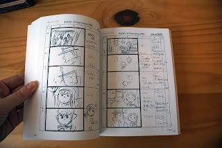
Professor Layton (レイトン教授, Reiton-kyōju?) series is a puzzle video game series for the Nintendo DS and is developed by Nintendo and Level-5. The series currently consists of four games and one film. Today I get the third game (Just released in the UK) but for the moment I want to talk about the story board book that came with the film.

The film itself is set after the 3rd game (which was a little annoying because the third game hadn't even been realised over here when I bought it)

With the film came the story board in book form...all of it. I find this kind of stuff amazing, seeing products before they're actually finished. (And knowing that not everything is neat and pristine)

Front: Layton and his massive face.


(Please excuse my dodgy fingers)

(The dvd box that the story board book came with)


And now for the game itself. I love this series. The story lines are always bigger than you think they're going to be and puzzles more challenging. They're not simple answers, the make you think. (Which is a good part of narrative design I believe.) The graphics are also quite appealing to look at.


(Solved a puzzle just to photograph the Correct Graphic. The incorrect one is in blue)

Edit: Andy Hamilton, get back to 'It's only a Theory'